


%20(1).png)
THE GUIDELINES GUIDE
Big guidelines, little guidance. For (NDA), I designed an AI-powered conversational search tool to help users navigate and understand brand guidelines for one of the world’s largest beverage companies.
-min.png)
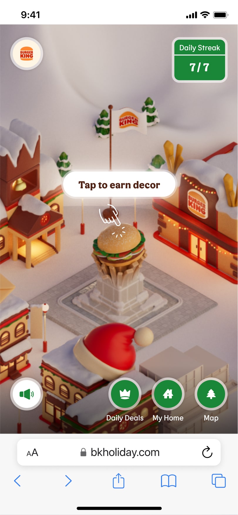
HOME FOR THE HOLIDAYS
In the BK Village, it's the most Whopper-full time of the year. Here, I translated the creative concept into an interactive experience, leading efforts to outline user flows, define navigation and detail interactions for the FWA award-winning website.
%20(2).png)
UNDERSTAND → JAM
A personal exploration into building a tailored music learning application with AI — combining audio analysis and AI interpretation to help musicians better understand, interpret, and play along with the music they love.
.jpg)
HOUR OF FINANCE
It’s not every day that you learn about budgeting aboard a spaceship drifting through space. Unless, it's with Intuit’s Prosperity Quest. Here. I led UX for the game’s latest level, "Pioneering Prosperity".
.png)
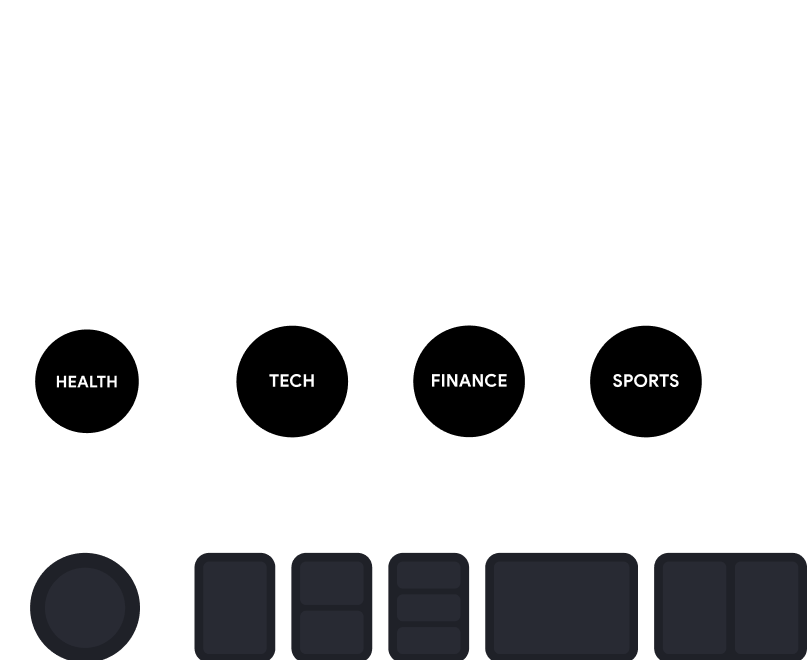
What if (insert idea here) ?
In the AI era, how will our interactions with computers change? For (NDA), I explored this question within a multidisciplinary team, designing and presenting AI driven features, frameworks and interactions for the internet of tomorrow.
-min.png)
ARE YOU SAFE FROM DUO?
At Duolingo, it's never too late to learn something new — right? For the latest edition of Duolingo’s Game Hub, I defined gameplay loops, detailed user flows, and drafted game UI, working within a larger team to launch on Roblox in December 2024.
.png)
it's electric
For Audi’s “Electricity Hub”; I'd work closely with Copywriters, Content Authors and Marketeers to create a five-page hub based on the OneAudi design system; successfully launching in the spring of 2022 and revamping in spring 2023.
%20(2).png)
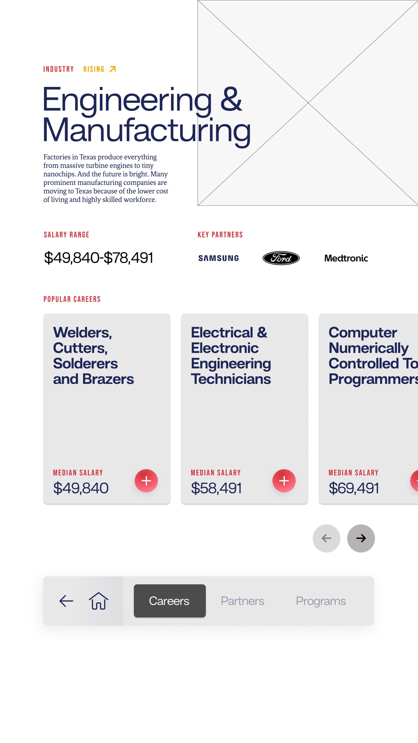
a texas welcome
For two installations within the TSTC Welcome Center, I'd translate strategic insights, user research, and accessibility best practice into several UX artifacts; creating the foundation for a multi-screen, large display experience.
-min.png)
spongebobble
Spongebob? Superbowl? Tiktok? To drive awareness for Nickelodeons Superbowl broadcast, I'd create wireflows to support the creation of an AR lens that transforms users into SpongeBob Bobbleheads.
.png)
OASI ZEGNA
For the Italian fashion house, I'd work within a creative team to tell the story of Zegna; creating user flows, defining interactions, and prototyping wireframes that helped shape the immersive web experience.
.png)
Location, location
For Audi's vehicle inventory page, I'd audit an existing experience to inform a full redesign of the "Locator" app; translating insights into interactions focused on achieving clarity and control for users setting their search location.
.png)
adidas community
As part of Adidas's community and social efforts, I'd work with strategists and creatives to craft the Adidas Community landing page, defining content hierarchy, information architecture, and using Adidas's component library to create wireframes.
A GUIDELINES GUIDE
Big brand, big guidelines, little guidance. For (NDA), I designed an AI-powered conversational search tool to help users navigate and understand brand guidelines for one of the world’s largest beverage companies.
Home for the holidays
In the BK Village, it's the most Whopper-full time of the year. Here, I translated the creative concept into an interactive experience, leading efforts to outline user flows, define navigation and detail interactions for the FWA award-winning website.
UNDERSTAND → JAM
A personal exploration into building a tailored music learning application with AI — combining audio analysis and AI interpretation to help musicians better understand, interpret, and play along with the music they love.
HOUR OF FINANCE
It’s not every day that you learn about budgeting aboard a spaceship drifting through space. Unless, it's with Intuit’s Prosperity Quest. Here. I led UX for the game’s latest level, "Pioneering Prosperity".
What if (INSERT IDEA) ?
In the AI era, how will our interactions with computers change? For (NDA), I explored this question within a multidisciplinary team, designing and presenting AI driven features, frameworks and interactions for the internet of tomorrow.
are you safe from duo?
At Duolingo, it's never too late to learn something new — right? For the latest edition of Duolingo’s Game Hub, I defined gameplay loops, detailed user flows, and drafted game UI, working within a larger team to launch on Roblox in December 2024.
A texas welcome
For two installations within the TSTC Welcome Center, I'd translate strategic insights, user research, and accessibility best practice into several UX artifacts; creating the foundation for a multi-screen, large display experience.
it's electric
For Audi’s “Electricity Hub”; I'd work closely with Copywriters, Content Authors and Marketeers to create a five-page hub based on the OneAudi design system; successfully launching in the spring of 2022 and revamping in spring 2023.
born in oasi
For the Italian fashion house, I'd work within a creative team to tell the story of Zegna; creating user flows, defining interactions, and prototyping wireframes that helped shape the immersive web experience.
spongebobble
Spongebob? Superbowl? Tiktok? To drive awareness for Nickelodeons Superbowl broadcast, I'd create wireflows to support the creation of an AR lens that transforms users into SpongeBob Bobbleheads.
Location, location
For Audi's vehicle inventory page, I'd audit an existing experience to inform a full redesign of the "Locator" app; translating insights into interactions focused on achieving clarity and control for users setting their search location.
adidas community
As part of Adidas's community and social efforts, I'd work with strategists and creatives to craft the Adidas Community landing page, defining content hierarchy, information architecture, and using Adidas's component library to create wireframes.
A texas Welcome
Everything's bigger in Texas. Desktop's become 55″ displays. Credentials become careers, at least at TSTC.
%20(1).png)
.svg)
WHAT IF (INSERT IDEA HERE)?
In the AI era, how will our interactions with computers change? I can't show you, but let's talk about it.
BK Holiday
In the BK Village, it's the most Whopper-full time of the year.
Let's Connect
Feel free to reach out through email or LinkedIn.


WHAT IF WE (INSERT IDEA HERE)?
For just over a year, I worked within a multidiscpilinary team to concept dozens of AI-powered features and frameworks for (NDA); grounding them in the way people perceive, understand and decide —asking how we might make the unfamiliar intuitive.
1. What does it mean to design for (and with) understanding?
2. When anything can become anything, what's the right thing?
3. If information is valuable to the extent you're able to use it, how might we make information more useful?
4. How might we improve understanding in the exchanges between users and AI tools?
5. How might content transform across mediums to better support varied interests, intents and goals?
6. What would a flattened web look like?
7. How might we meaningfully accelerate people in their day to day workflows?
8. How might AI tools enable and empower instead of co-opt and compete?
9. For AI tools, when is it best to provide convenience? Control? Proactiveness? Reactiveness?
10. At which point does doing something become doing too much?
11. In a web of generated content, where is the space for you and I?
.png)
I've helped shape the strategic and conceptual backbone for my teams work— often taking a lead role in idea generation, opportunity framing, and the translation of abstract concepts into frameworks and interaction models.
And of course, with such a focus on new ideas, I've also spent a lot of time discussing, explaining and presenting, which has further developed my skills as a presenter.

The only certainty is change. I'm not sure who said that, but I know I've heard it — and it rings especially true here.
When I first started in UX, I used powerpoint to create wireframes. Now, I can use any one of several "from idea to app in minutes" tools. Well, at least that's what the ads tell me.
Now this doesn't mean that I should (which is another topic in itself) — but I could. And in that, is my first lesson.
It's clear that the AI landscape is changing and changing fast. Zooming out, the design landscape. Zooming out more, the creator landscape. And across all of those perspectives is the importance of knowing (or at least trying to know) what's possible.
So i've learned to ask, at this moment, what can be done? If I don't know, I seek the answer. I read the article. I watch the video. Or my recent favourite, I go down a deep rabbit hole in ChatGPT.
I've learned to embrace this as part of the job. Sometimes, I think it actually is the job.
Which brings me to the second lesson.
More important than the fact that something could be done, is why it would be done.
So I think, do I need a hammer? Or do I need to fasten a nail into a wall? Do I need a nail? Or do I need to hang a painting? But why the painting? And so on and on until the core, until the why.
This is what good design has always been—tracing solutions back to intention, back to perception, back to understanding.
So somehow, even though so much is changing, nothing is changing. We’re still just trying to solve (someones) meaningful problem, and AI is our newest lens for seeing how.
A texas welcome
I led UX design for two interactive stations within the Texas State Technical College (TSTC) Welcome Center, helping prospective students bridge the gap between their education and career.
Stepping outside of laptops and phones, this work was showcased on several 55″ displays, requiring a mix of UX, spatial, and accessible design thinking —earning positive reviews from our client and an expansion to other campuses.
-min.jpg)
TSTC star as a UI element.
Finish high school. Go to college. Get a job. It's the well-worn promise of traditional post-secondary education. And for many students, a broken promise that leaves them to figure out how their credentials connect to potential careers.
In Waco Texas, however, they're drinking a different kind of kool-aid (in the words of our client). TSTC looks more like a hands-on workshop than a lecture hall—rows of welding stations, utility poles, and students in work boots instead of backpacks.
The staff here have one mission. Help more Texans land well-paying jobs. But first, Texans need to know about it. Better yet, they need to see the opportunity.
Design and build two interactive stations within TSTC’s new Welcome Center—raising awareness to the school’s mission and wide range of programs, elevating the brand’s perception, and positioning TSTC as a launching pad for real careers in the eyes of prospective students.
I led UX for both interactive stations, translating strategic insights, user research, and accessibility best practices into the core UX artifacts that shaped the multi-screen, large-format interactive experience.


Pathway Explorer and About TSTC
Before designing anything, we needed to understand TSTC at its core, asking:
1. Who are they?
2. Who do they serve?
3. What makes them different?
Over the course of two full day workshops, we investigated these questions with TSTC stakeholders, exploring their goals, their vision for the Welcome Center, and the diverse audiences they hoped to reach.
These conversations gave us both empathy and direction—clarifying the needs, anxieties, and motivations of future students, surfacing the key business goals and messages that would shape the story this space needed to tell.
.jpg)
.jpg)
Mark, Sofia and Jay (not shown)
With the workshop insights in hand, my next move was to translate them into something the client and internal team could align behind.
Working closely with our strategist, I scanned through the summary notes, asking:
1. What information are users searching for?
2. What already exists?
3. What structures would best support the experience?
Then, with the answers to those questions as context, I plotted story beats, defined an information architecture, and developed three personas from our initial mindsets.

-min.jpg)
With the foundation in place, we shifted into execution—designing a responsive, accessible experience for large-format touchscreens that brought TSTC’s story, programs, and career paths to life.


8 more unique pages.
I created a clickable prototype and tested it with university students, co-writing the testing script, observing the session, and translating the results into actionable takeaways for the team.

We designed a system that supported both local and global movement. Users could see where they were and shift between industries and programs easily. Contextual tags like “popular” or “high earning” guided exploration.


experience, the Smart Nav
Designing for a fixed-height touchscreen meant no vertical scroll. I researched ADA standards and real-world examples—walking malls and reading accessibility white papers—to make the experience inclusive.This led to one of my proudest contributions: an accessibility toggle that let users lower the interface for easier reach.
%20(1).svg)
.svg)

We used cards, carousels, and tabs to accommodate videos, data, testimonials, and text—delivering rich content without overwhelming the screen.

We aimed for a look that was technologically forward, but still human. The TSTC star was even repurposed as a UI element. Visual design was fast-paced, collaborative, and constantly evolving.

Both stations launched in summer 2024. At a board dinner hosted in the Welcome Center, one of our lead stakeholders summed it up:
“People freaking love this place.”
And a few months later, TSTC reached out to extend the work to other campuses—a testament to the value of the experience we helped bring to life.
-min.jpg)
-min.jpg)
This was a big project with a big team, so it was rewarding to find my voice and contribute to something that blended content, interaction, and space.
I’m proudest of the thinking i did around accessibility. Designing for large displays was both a new experience for myself and others on the team, challenging me to embrace a new topic and lean into my skills as a facilitator. The whole team needed to be aligned, and it was my job to support that.
If I could work on this project again, I’d push for more testing with students before launch. Still, as a "MVP", it laid a strong foundation for future iterations.
BK HOLIDAY
For the 2024 holiday season, I helped turn a playful creative concept into a rich, return-worthy digital experience for Burger King. Part advent calendar, part virtual destination, 'BK Village' aimed to drive repeat visits and deepen brand engagement during the busy holiday season.
I led the UX, translating festive ideas into clear flows, intuitive interactions, and a navigational system that made the entire experience easy to enter and rewarding to explore — closely collaborating with my teammates from creative, 3D, and development along the way.

-min.jpg)
-min.jpg)
.jpg)
I joined the project a month into a four-month design sprint, after the initial user flow and lo-fi wireframes had been mapped out.
My role wasn’t to start from scratch, but to pick up the thread, become fluent in the journey, and guide how the experience evolved. That meant spotting what was working, surfacing what could be stronger, and shaping how the design responded to client feedback, new ideas, shifting requirements, and the realities of bringing it all to life.

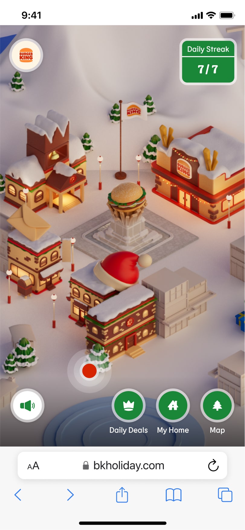
For the experience, three key activities: redeem the daily deal (i.e. a coupon for a BK menu item), collect decorations for a holiday home with the incentive of weekly streak rewards, and explore the holiday village.
The centrepiece for the experience is the village. hence the UI should be visually and cognitively unobtrusive.
The village will be the experiences base layer, with panels that can be opened above to reveal additional content. Panels will have minimal nesting, with the user staying a 'click' away from the village layer of the experience.
-min.jpg)
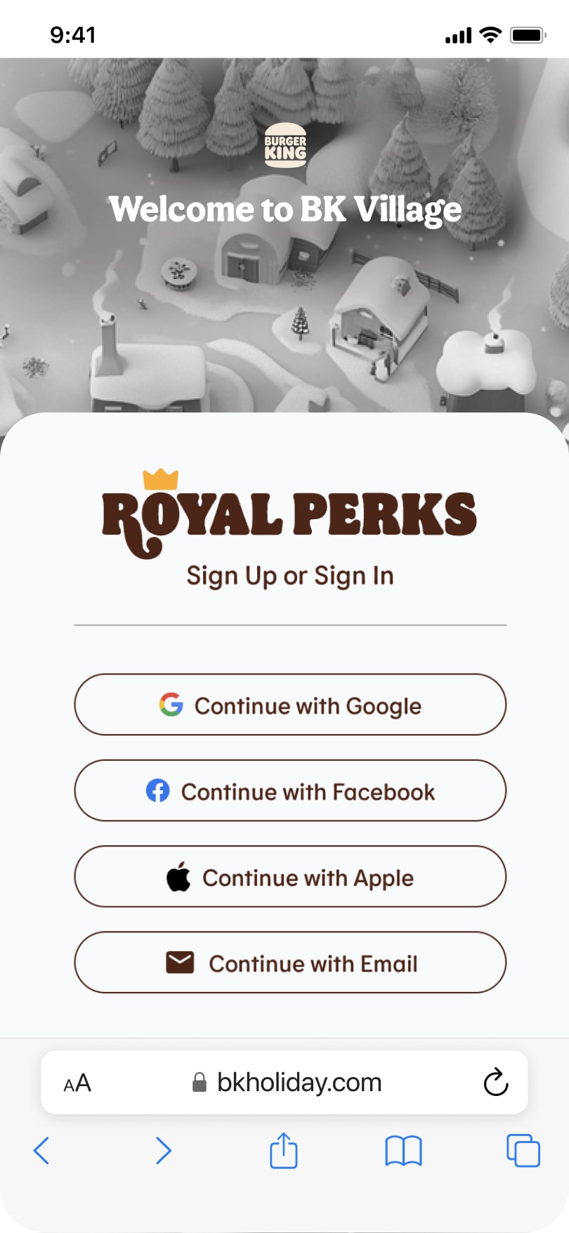
Each day, users are to be presented with a daily deal that they can redeem through their BK account.
This is the primary incentive for users visiting the experience, and its weight should reflect that. Further, users will need to log into their BK accounts to claim, and if claimed will exit the BK village experience and be brought to an external page.
If entering for the first time during the day, users are presented with the daily deal modal. If not, users will find the daily deal within their deals page, which will be flagged with a red dot in the navigation if the deal is unclaimed.


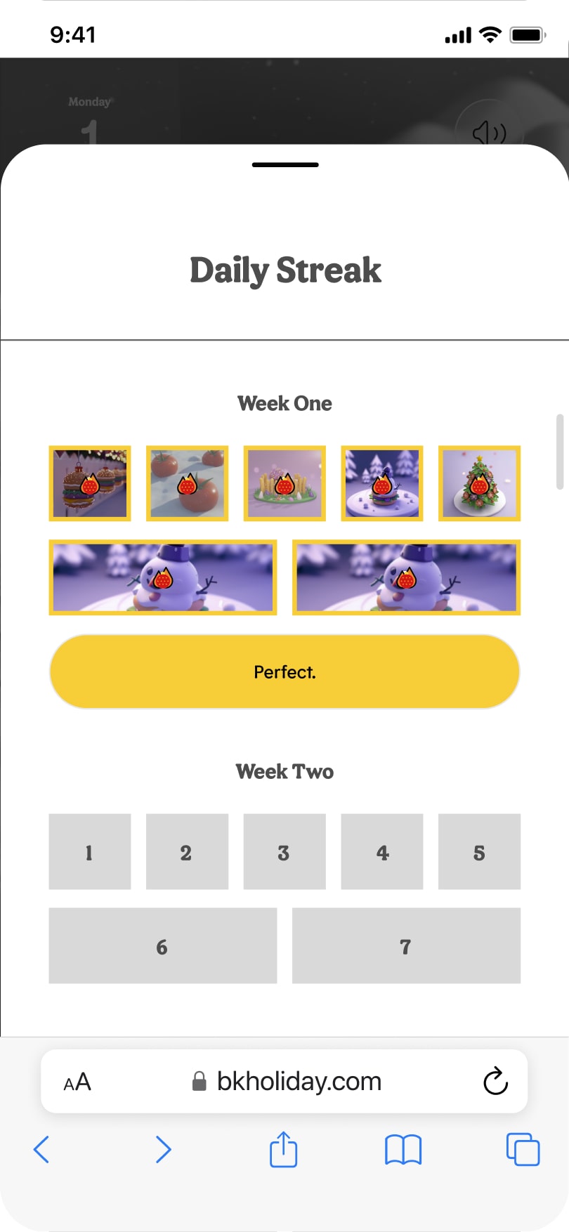
To incentive return visits, users may win weekly prizes through collecting decorations each day of the week, earning a weekly streak.
Creatively, there is a desire to connect earned streaks to room extensions of the holiday home. Further, users need to be aware of the streak reward, and understand how it is separate from the daily deal mechanic.
Home extension will happen automatically so that multiple instances of the home don't exist. Users will be made aware of streaks through the streak calendar, similar pattern in gamified experiences, positioned top right on the screen.

-min.jpg)
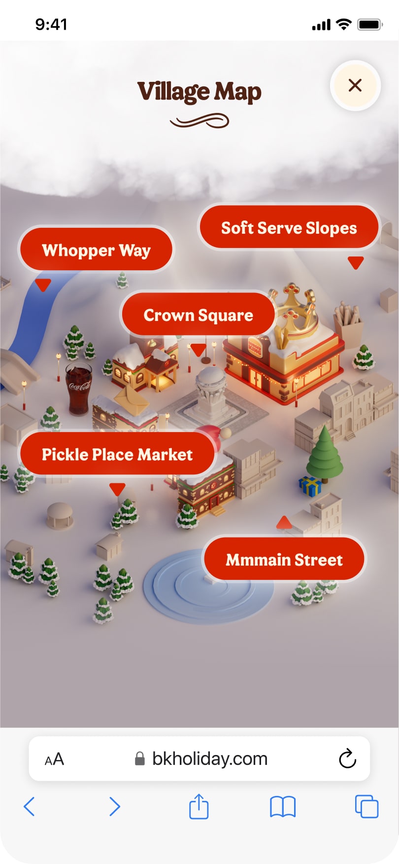
Users should be able to explore the different areas of the village.
Each daily deal will have a predetermined date (e.g. December 5th), and be positioned at a specific location within the village. After collecting, users may browse through the open areas of the map.
To navigate, users may pan, zoom or use the "bird's eye' view of the village. There, locations containing unavailable daily deals will be obstructed through a 'cloud'. To increase engagement while browsing, fun fact hotspots are placed throughout the village.


After months of effort, the BK Village launched just in time for the holidays on December 2nd 2024, seeing roughly 15 million daily requests and around 80,000 decor-collection interactions each day—a strong signal for one of the projects key goals, user engagement.
Beyond analytics, the project generated engagement through the press, on socials (notably Reddit — we'll come back to this), and was celebrated publicly by the client, who called out the team’s attention to detail and the benchmark it set for future digital experiences.
A benchmark which, just over a month later, garnered further recognition when the site was honoured by the FWA as the Site of the Day, recognizing the craft and ambition behind the work.
This was a good one. First, the people at Monks and Burger King that helped pull this together were talented, thoughtful and great people to work with. Second, having to build something for a major brand that would be marketed towards a wide audience presented a high exposure opportunity for work I helped shaped.
And with that, I takeaway two things:
We "discovered" late into the project that that there was an inherent tension in the experiences key flows—on one hand, we wanted users to leave to redeem coupons (this was a technical requirement); on the other, we encouraged them to stay and collect decorations. To avoid unnecessary churn, the client goals needed to be resurfaced, and this needed to be framed as intentional. Once this was done, we could move forward aligned and on the same page.
When the project hit Reddit, conversations shifted from design to deal value. For me, this was a reminder that UX is only as strong as the product it serves. A seamless experience won’t land if what’s offered isn’t seen as valuable. The design is the delivery—value is what makes it stick.